

Monday, August 27, 2012
Great Falls Park

Monday, August 13, 2012
Paperman
.jpg)
Aesthetically Paperman is simplistic, focusing mostly on large flat shapes and using lighting and blurs to bring focus into the composition. With limited details and color, the film strictly focuses on using the visuals to frame the story. In Disney’s Paperman talk, the creators made a comparison between the 3D films we see today and the traditional 2D approach they used for Paperman. While the 3D movies today have advantage of creating depth and complex settings, it can become so appealing that sometimes the visuals overshadow the story it is trying to tell. I think that is where Paperman really excel. The ratio of visual information and storytelling was just right so that it created a harmony that is best suited for telling Paperman’s story. For me, watching Paperman allowed me to see my role as an artist in a bigger picture. I have always thought that a best design should be so captivating it can stand on its own. While that may be true in many cases, I think it’s important to also consider how one design stands amongst a whole bunch of other designs within a film as a whole, and hit that golden ratio where visuals can most effectively deliver a story.
Another thought I had after seeing Paperman was that portrayal of humanity can be a very strong device to capture the audience’s attentions. Paperman tell a story about how a small decisions can lead to a life changing experience. It’s a theme that is universal and can easily be related with. Even when the character does not exist in the reality, as long as we can see them responding the way we do, showing ranges like curiosity, confusions, determination, and love, they can feel real even on a flat screen. I think that is portion of the reason why many Miyazaki films are also successful. Take Princess Mononoke which illustrates the struggle between polar justices. We can see that both sides of the opposing forces are fighting for what they believe is justice, and neither sides are wrong in their motives. I think simulating a real-life behavior into animated characters adds a layer of depth and helps guide the audience feel engaged in the narrative. It’s definitely something I can explore more as I further myself in character design and storytelling.
Disney’s Paperman will be presented right before Wreck-it Ralph in November and I highly recommend everyone to go see it. It will be an experience to remember!

Monday, July 23, 2012
Silent Amusement


I did this piece recently to aiming to practice drawing nature, lighting, and color. It all started after watching Princess Monoke and I had a huge urge to draw a forest scene. Although I have seen the movie many times I keep coming back to find new things to get inspired by. I was very moved by the complexity of the storyline, the beauty of visual language, and depth of the research and appropriate connection to the old Japanese culture. From type of spoken language to the way clothes were worn in order to reflect maturity, the whole movie was so carefully thought out that I'm in awe with the amount of information that Miyazaki is capable of handling. That man is a true beast. From doing this piece, I got to explore more approaches in drawing the variations in nature. It also took me a little longer than usual because I spent so much time making decisions for subtle color differences in many areas. It really made me realize that the amount of decisions made within a piece is exponentially related to how rendered the piece is.

Monday, July 9, 2012
A Mac girl

Sunday, July 8, 2012
Broken Pride

Tuesday, June 26, 2012
Journey

Monday, June 25, 2012
Daily Doodles


Wednesday, June 20, 2012
Arrival
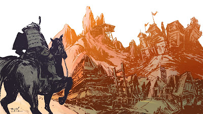
I discovered that this ink brush I have is very useful. It emulates the bumpiness of lines that is drawn on textured paper, and also leaves a clear solid marks similar to inking in real life. I used this brush in the forest piece I did last week and instead of incorporating into layers of painting, I tested to see how the brush works when used for inking by itself. Here’s my result and I think it turned out okay. I like the brush but I’m not exactly familiar with this method of work and I think there’s more to uncover. More to come!
Thursday, June 7, 2012
Intersect

This painting was supposed to be rough color practice but I ended up liking it so I went more in depth. I’ve been noticing the amount of buildings I draw in comparison to organic environments, so I decided to revisit the mother nature.
Tuesday, June 5, 2012
Ode to the Bouncer

I just started tumblr and that gave me excuse to make updates so I started doodling a lot of pictures. Just kidding, I just graduated and have nothing to do at the moment so I'm just spending more time with my lover art. So anyways, I painted a character named Cherry from a music video called Ode to the Bouncer by Studio Killers, its a super catchy song with awesome sass and perky visuals. If anyone’s interested, all of their songs have great rhythmic dance feel, and their music videos (I think there are only two so far) are very well made. Its worth checking out!
Monday, April 16, 2012
Aerodynamos Teaser
So here's the latest update on my animation thesis Aerodynamos! I finished enough footage to compile into a short teaser for the animation.
Here are also some of the updated concept designs including 3d projections and characters. From now until graduation, I will be focusing on the designs for the project instead of production so that I can make improvements on my portfolio. After graduation I'm planning to finish up the rest of the animation so stay tuned!


Wednesday, April 11, 2012
Self Portrait and Color Study


Sunday, January 8, 2012
Thesis - Shot 2

Here's my current progress on the thesis. I changed the storyboard a little bit and instead of having the camera do a long spinning descent from the top of the tower into the interior, I decided to just have side scroll to avoid having to deal with too much extra detail. Over all this shot took 11 individual paintings to complete along with a 3D set up. The 2nd shot of the thesis has been by far a big challenge for me because there were so many technical problems along the way. Although at first I thought that this technique was some kind of dream trick that allowed me to do anything I imagined, I soon realized it had limitations. In the beginning I planned to have Tiger's head in the shot and the camera would pan sideways across its head. But I realized that this was almost impractical due to the amount of time it would take me to model a surface for the projection and painting the tiger texture from multiple angles. The ears of the tiger became a big issue because for it to look fully projected as the camera slides across, I would need to break apart the model into smaller parts and draw textures for left side and the right side of the ears, not to mention there are two ears and a whole face to worry about. So the solution I came up with is to get rid of the head all together. Instead, I just had the tiger's body in the shot and thankfully that was manageable. Still, modeling a mock up of a donuts shape and then painting in two sets of textures from different angles was not as easy as I imagined it to be.
View full size


Another thing I had trouble with is the discontinuous work flow. So far my workflow for projections have been 1) building a primary 3D set up from a sketch, 2) drawing in basic forms to fill the environment, 3) camera test, 4) painting in final details, 5) repeat 3-5 until everything is filled. This allows me to make sure each projections works properly but since I had to paint in everything by parts, keeping the color work together as a whole was a challenge. This shot took me almost 2 weeks and it probably took too long considering the amount of time I have left to finish this project. So far I would like to have at least 1 shot a week. I have around 23 shots total so I might be in a bit of trouble if I want to get this done by May. I'm just hoping that some shots wont take as long and that I would get faster. If worst comes worst, I may have to cut down a few shots and make a shorter animation. I hope I won't have to do that. Crossing fingers.
LAIKA works
Here are the links to the LAIKA commercial works I did over the summer. The clients include: Toys R Rus, Honda, and Orville Redenbucker. I was working as a concept artist making characters, environments, set designs, layouts, and colors. Unfortunately I cannot show the raw drawings I did at LAIKA but here are the final products!
LAIKA - Honda Pilot from William Niu on Vimeo.
LAIKA - Orville Redenbacher Adios Trans Fat from William Niu on Vimeo.
LAIKA - Orville Redenbucker Whole Grain from William Niu on Vimeo.
LAIKA - Toys R Rus Big Book from William Niu on Vimeo.
LAIKA - Toys R Rus EX from William Niu on Vimeo.
LAIKA - Toys R Rus BCSE from William Niu on Vimeo.
LAIKA - Honda Pilot from William Niu on Vimeo.
LAIKA - Orville Redenbacher Adios Trans Fat from William Niu on Vimeo.
LAIKA - Orville Redenbucker Whole Grain from William Niu on Vimeo.
Monday, December 12, 2011
Thesis - Panoramic Shot

Now that storyboarding and a whole bunch of pre-production designs for my thesis have been solidified, I can finally painting in finished backgrounds! It has been so long since I worked on anything finished so this was such a great feeling. This is a panoramic shot that is going to be the first establishing shot for the whole animation. I'm going to camera project this image to emphasize depth and see how it looks. Over the winter break I'm going to be working on more finished backgrounds in order to catch up on my thesis. Its going to be fun!
Wednesday, November 16, 2011
Thesis Progress


So here's my progress of the thesis so far. Instead of 20-30 sec animation as I initially planned, I will be extending the time to a minute long short animation about two rollerblade kids racing each other in a 3D city. As I have mentioned before, I will be using camera projection technique for the background city and then go over on top in 2D for the character animation. Here I have a primary animatics, camera projection test (for full rotation camera angles), shot study, and then character sheet. At this point I'm close to having all the pieces I need for start painting in the backgrounds which is going to be fun and finally doing something fully rendered. In the coming weeks, I'd like to have a more realized animatics as well as character sheets. I will be attending CTN expo this week and I'm super pumped!
Wednesday, August 24, 2011
Preparing for Thesis


For my senior thesis, I am planning to make an animated short which incorporates 2D painted background projected onto 3D space. I think this would be a great way to present my environmental paintings and after doing some quick experiments, I'm pretty exited for its potential. I did these to get the hang of the process. After some trial and error, I feel like I'm finally at the starting line. More to come for sure!
Monday, August 1, 2011
Aqua City

Here's finally something I spend time on outside of work recently. I really wanted to mess with color and be aware of how lighting affects it so I picked to do a city with loads of colors. Tekkon inspiration all the way across the sky.
Friday, July 15, 2011
Animated doodle


I've been wanting to make drawings outside of work lately and also been feeling slacking off with animation so I tried to get back to it with this short sequence. I was originally doodling some random action scene and thought it might be fun to make it in animation.
Wednesday, July 13, 2011
Bangs Bean Booble

Its been so long since I made an update. I'm currently interning at LAIKA in Portland, OR as concept artist and the work has been taking most of my time. I manage to slip in a quick drawing here that started off as random geometric shapes which then was interpreted into this drawing. Since most art I make at work have constraints in response to different needs, I wanted to do something I miss; painting for myself. I was definitely thinking James Jean as I was drawing. I wanted to play with soft gradient feel combined with painterly rendering. It was fun :)
Subscribe to:
Posts (Atom)